Heineken
Moving Heineken's finance teams from manual Excel sheets to a standardized reporting platform on SAP Analytics Cloud.
Category
Finance, Design Systems, Data Visualization
Role
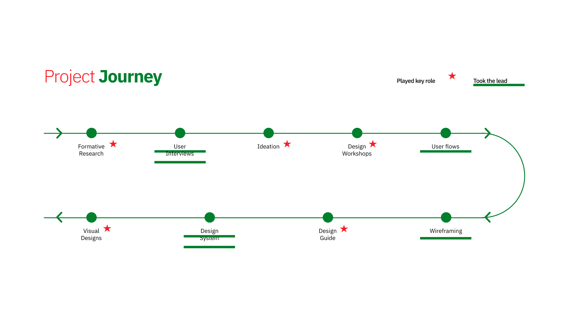
UX researcher
Timeline
10 Months

Overview
Rethinking how finance teams work with data
Heineken’s finance teams across Europe were using Excel to manage and analyze their reports. While it gave them flexibility, it also caused problems, the process was manual, inconsistent, and hard to manage across regions. Each team had different reporting needs, and the tools they used couldn’t fully support that. Our goal wasn’t just to move to a new platform, but to rethink how finance teams worked with their data. We helped them shift to SAP Analytics Cloud, designing a reporting experience that was simple, consistent, and easy for anyone to use, even without a finance background.
We worked closely with analysts, finance leads, and business teams across Europe, and by the end, delivered a unified reporting system that made data more accurate, helped the business make decisions much faster, and easier to understand.
Problem
Heineken’s finance teams relied on Excel for reporting, but each region had its own version. The lack of a consistent system made it hard to compare data, share insights, or scale across teams, slowing workflows and making quick, confident decisions difficult.
Key issues we found:
Reports looked cluttered and were hard to use, especially for non-finance users.
Each region’s version was different, making it tough to compare or make quick decisions.
New employees needed weeks of training to understand the reports.
Finding simple insights like profit trends took too much time.
There was no mobile access for meetings or travel.
These issues slowed down work and made decision-making harder. The team initially wanted to just switch tools, but we aimed to build something modern, clear, and genuinely useful for everyone.
How did we solve it
We standardized the experience
across regions
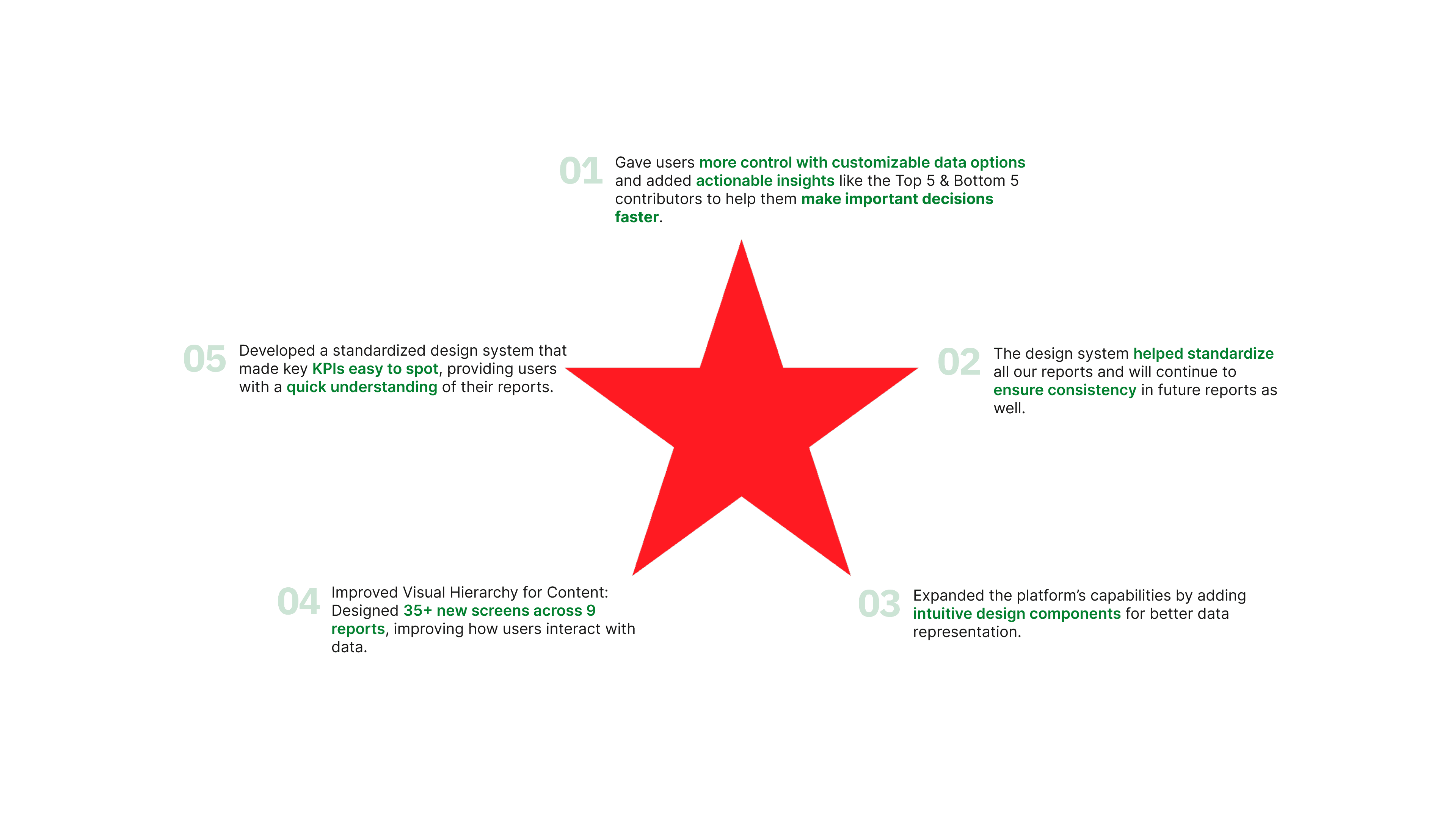
To make reports easier for everyone to use, we created a design system that brought visual consistency to all reporting tools across European regions. This reduced confusion and ensured that, no matter where someone was based, they could interact with data in a familiar and intuitive way.
Designing Customized Dashboards for Different Roles
Instead of showing everyone the same thing, we built custom dashboards tailored to different roles. Each view focused on the key insights that mattered most, with clear navigation so users could quickly move between sections without getting lost.
Making It Easy to Find the Right Information
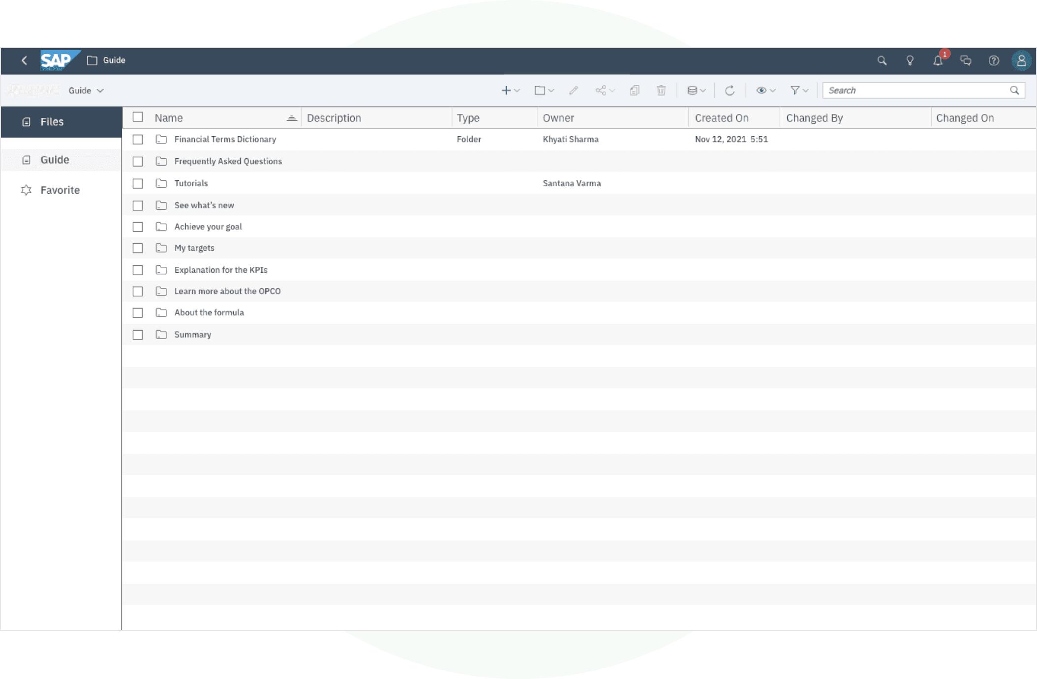
We added a document library that lets teams dive into regional details and access the information most relevant to their work.


User Types
1. Power User
2. Viewers
3. Business
User Groups Diversification
1. Leadership
2. Managers
3. IT
4. New Bee
5. Mid-Senior Analyst
6. Non Finance background
7. Other viewers of 16 types of reports